2018 S/S Pantone Palette
Source: image
Pantone has just released 12 colours for its 2018 Spring trend report. The colours are Meadowlark, which is a bright yellow, Cherry Tomato, Little Boy Blue, and various other hues with shades of purple (Pink Lavender, Ultra Violet, and Spring Crocus) topping the list.
We have matched some of those colours with our very own solid colour decors!
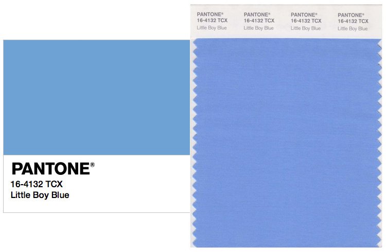
Little Boy Blue – 2503
With expectations as high as a clear blue sky, Little Boy Blue is not only just for little boys. Suggesting expansiveness and continuity, this shade of azure emits feelings of reassurance like that of a promising new day.
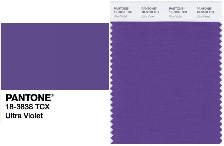
Ultra Violet – 3002
Conveying originality and ingenuity, the enchanting UltraViolet is a distinctive and sophisticated shade of purple that fascinates and intrigues.
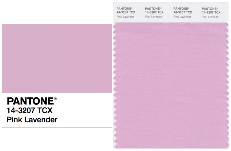
Pink Lavender – 3027
Pink Lavender is soft and romantic. Much like the petals of a pink lavender, it charms with its soothing sense of reposure.
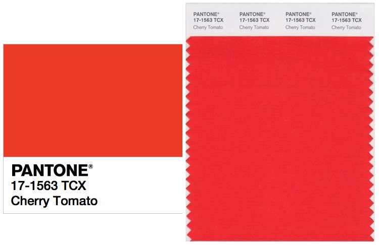
Cherry Tomato – 7019
Cherry Tomato is a tempestuous orangey shade of red that exudes heat and energy, like the ever burning flames of one’s fiery passion. It demands attention and exudes courage. It is a colour hard to forget.
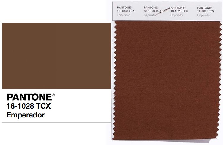
Emperador – 3013
The rich chocolate infused brown Emperador emits a sense of absolute strength and substance to the spring 2018 palette.
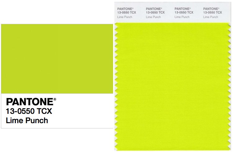
Lime Punch – 3019
Extremely eye-catching and piquant. Lime Punch strikes a chord with its incredibly zesty presence in the spring 2018 colour palette.
Check out the full solid colours decor collections here, or directly contact us for sample viewing for an accurate display!